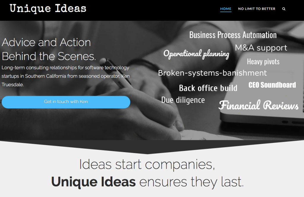
Okay, progress. I like this design for the website. I guess I will never grow out of my love for B&W imagery. Perhaps those late nights with slightly old photo chemicals took its toll on me! At any rate, I like. It feels right to me, and that is important. Rather than write out my thoughts in a document, I thought I’d form the message as I went. That process works well when you are doing everything yourself — not so great if you are working on a team. But hey, I like to right-size the approach, always. The home page is good, but of course not perfect…so it’s ready.
For those interested, this is built on a wordpress theme called “X” which I’ve used a few times before. It really goes beyond just a basic theme, and I highly recommend you drop down $65 and get this. You can find them here. I took a quick look at their Pro version, but since that changes up things a bit, I decided to go with what I knew.
I also put some of the basic SEO stuff in place. Yoast on the wordpress side and added the uniqueideas.com domain into Google Search Console. I thought I use Disqus for comments this time and see how that pans out. I usually get suitable imagery licensed for free from Pixabay.
And just to capture some of the infrastructure stuff: The WordPress site was put into an existing Google Cloud Compute linux instance. That instance is managed using Virtualmin for the most part–makes it easy to add and delete domains/sites. Cowboy coding for now, but will eventually put dev/staging/source control in place.
It was a good couple of days. Next, I’ll get started on writing content pages.
–Ken

